

Window frame colour is a long-term specification decision. Once installed, it is difficult to change without altering the window's appearance. For that reason, the colour should be selected in relation to the home's fixed materials rather than from a colour chart alone. The most reliable method is to work outward from what cannot be changed, meaning brick, stone, stucco, roof and siding, then decide how much contrast the façade can carry, and only then confirm how the frame will read from inside the room.
This guide covers how to build a frame colour decision from the exterior palette, which finishes are currently available, how colours behave with different cladding materials and architectural styles, what the 2026 colour direction actually signals, and how colour interacts with thermal loading, coating durability, energy performance, and long-term maintenance.
Window Force specifies and applies frame finishes across thousands of orders each year, confirming colour availability against the exact profile series and window type on every order before it enters production. That work runs through our own 80,000 sq ft Ontario production facility and reaches homeowners through an authorized dealer network, which means we see both ends of the colour decision: the sample held against a brick wall on site and the finished profile coming off the line. The guidance below reflects what that combination shows about which colour choices remain visually effective over time and which ones get revisited.
Key Takeaways
- Frame colour should be chosen as one element of a complete exterior palette, starting from fixed materials such as brick, stone and roofing rather than from personal colour preference alone.
- Light finishes visually recede and hide uneven trim lines, while black, Iron Ore, and other dark finishes define openings sharply and expose any inconsistencies in alignment or sightlines.
- Dark finishes create stronger visual contrast and require careful consideration of finish quality and profile design on highly exposed elevations.
- Frame colour has little direct influence on a window's rated energy performance. Homeowners still deciding on window style before settling the colour can browse the full range of window types and operating styles, since frame depth and profile series can affect which colour finishes are available. U-factor and Energy Rating are determined primarily by the glazing, low-emissivity coatings, gas fill, spacer design, frame construction, air leakage and installation quality.
- Dual-tone configurations, most commonly a dark exterior with a white interior, resolve the conflict between exterior contrast and interior flexibility.
- Maintenance differences between light and dark finishes are real but modest, and finish quality can have a greater effect on long-term appearance than the specific shade selected.
How Should You Choose Window Frame Colours for Your Home?
Frame colour selection follows a hierarchy. The elements that cannot be economically changed set the constraints; the elements that can be repainted or replaced provide flexibility; and the frame sits between the two because it lasts for decades yet is visible from every angle of the property.
Start With the Fixed Exterior Materials
Brick, stone, stucco and roofing define the undertone of the façade. Red and orange brick carries a warm undertone that fights cool greys, while charcoal architectural shingles and grey stone push the palette in the opposite direction. Identify whether the dominant materials are warm or cool before shortlisting any finish, because a technically attractive colour placed against the wrong undertone reads as a mismatch rather than a design choice.
Siding and stucco are easier to change than masonry, but they still represent a significant investment and rarely get updated on the same cycle as replacement windows. Treat them as semi-fixed. If a repaint or re-clad is planned within the next two or three years, coordinate both decisions at the same time rather than committing the frame colour first.
Decide Between Contrast and Coordination
Two of the most common strategies are coordination and contrast. Coordination keeps the frame close to the cladding tone, creating a calm façade, while contrast makes the window openings a more prominent architectural feature.
Contrast is unforgiving. When frames are dark against pale cladding, every deviation in opening alignment, header height and mullion spacing becomes visible from the street. Homes with irregular window placement, mixed opening sizes or additions built at different times usually photograph better with a coordinated palette, while symmetrical elevations reward high contrast.
Check the Interior View
For most homeowners, the frame is viewed from inside far more frequently than from the street. A dark interior frame narrows the perceived opening, absorbs light at the reveal and demands that interior trim, flooring and cabinetry be coordinated around it. A white or cream interior remains neutral against any décor scheme and does not need to be revisited when interior finishes change.
This is a common source of regret in colour selection, but it is also one of the easiest issues to avoid, since dual-tone construction allows the two sides to be specified independently.
Windows Near Me
Which Window Frame Colours Are Available From Window Force?
The current colour programme is organized into standard production finishes, woodgrain finishes and custom colour matching for project-specific requirements, with finishes available across multiple window types and profile series. The palette below is presented as a practical reference point for how tonal families behave, not as a universal recommendation.
Standard Colour Finishes
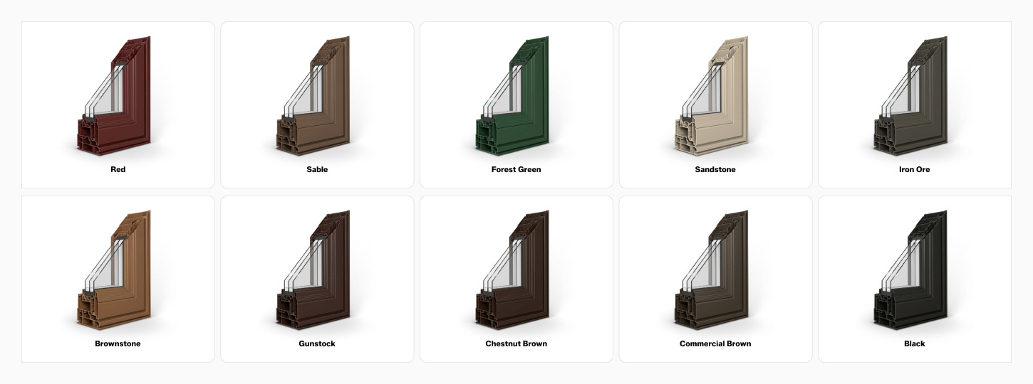
The standard range spans neutral whites and creams, greys, browns, green and black, which covers the majority of residential exterior palettes in Canada.
| Finish | Tonal family | Visual effect | Typically pairs with |
| White | Neutral light | Recedes, maximizes perceived glass area | Any cladding, traditional and transitional homes |
| Cream | Warm light | Softer than white, slightly warmer reading | Red brick, beige stucco, heritage-inspired homes |
| Cashmere | Warm neutral | Low contrast, understated | Taupe and greige siding, natural stone |
| Pebble | Cool neutral | Quiet mid-light tone | Light grey siding, mixed stone and stucco |
| Sandalwood | Warm mid | Blends with earth tones | Beige brick, wood accents, stucco |
| Dover Grey | Cool mid | Soft definition without heavy contrast | Grey and blue-grey siding |
| Slate | Cool deep | Architectural, less severe than black | Light siding, charcoal roofing |
| Iron Ore | Deep charcoal | Strong definition with a softer edge than black | Contemporary and transitional exteriors |
| Black | Maximum depth | Highest contrast, graphic framing of openings | White, light grey and red brick exteriors |
| Chestnut Brown | Warm deep | Traditional warmth | Brick, cedar, natural stone |
| Commercial Brown | Warm deep neutral | Utilitarian, forgiving of dust | Mixed material and multi-unit exteriors |
| Sable | Deep earth | Softer alternative to black | Warm modern and nature-led palettes |
| Forest Green | Saturated deep | Historic and landscape-driven character | Cedar, stone, heavily treed lots |
Colour availability can vary by profile series and window type, so the finish should be confirmed against the specific configuration during quoting rather than assumed from the palette alone.
Custom Colour Matching
For projects that fall outside the standard range, custom colour options and colour matching are available. This matters most for heritage restorations working to a documented palette, for multi-unit developments with an architectural control schedule, and for homes where existing aluminum cladding or a previously matched door set must be reproduced accurately.
Custom finishes typically extend lead time compared with standard production colours, and they cannot be ordered on the same compressed schedule as a stock finish. Confirm with the window company producing the units which reference standard is being matched and what tolerance applies, since a visual match under showroom lighting is not the same as a controlled colour match to a specified value.
Because every unit is built to order rather than pulled from pre-built stock, a matched colour is scheduled into the production run instead of being applied to a stock profile after the fact. The match is referenced to a documented target, checked under controlled lighting on the line, and released through the dealer handling the project, so the same reference travels with the order from approval through to delivery. Production has run on that model since 2007, and CSA certification applies to the finished product whether the finish is a standard colour or a matched one.
Woodgrain Finishes
Woodgrain finishes are offered as an alternative to solid colours, providing a wood-like appearance on vinyl profiles. These are factory-applied and quality-controlled for colour consistency, and they are covered in detail further down in the section on wooden frame colours.
Which Window Frame Colours Work Best With Different Architectural Styles?
Architectural style narrows the shortlist faster than any other single factor, because it establishes what the eye expects at the opening. The combinations below are starting points rather than rules, and they assume the cladding and roof have already been assessed.
Traditional and Heritage-Inspired Homes
Traditional elevations were designed around painted wood sashes in white, cream or deep historic tones, so light neutrals and saturated heritage colours read as correct. Forest Green and Chestnut Brown can evoke the character associated with traditional historic woodwork. Black is workable on traditional homes when the trim detailing is substantial enough to carry it, but on a modest elevation with narrow casings it can look imposed rather than original.
Modern and Contemporary Homes
Contemporary architecture relies on line and proportion rather than ornament, so the frame is doing structural visual work. Black and Iron Ore emphasize the geometry of the opening and suit large fixed units and clean rectilinear massing. Slate offers a similar effect with slightly less severity, which is useful on north-facing elevations where a very dark frame may visually blend into the opening under low-light conditions.
Farmhouse and Transitional Homes
Modern farmhouse exteriors are built on deliberate contrast, most often white or pale grey cladding with dark frames, dark roofing and natural wood accents. Transitional homes sit between traditional proportion and contemporary detailing, making mid-tone finishes such as Sable, Cashmere and Dover Grey effective, as they provide definition without committing the façade to a hard graphic treatment.
| Architectural style | Strong choices | Effect | Approach with caution |
| Traditional and heritage | White, Cream, Forest Green, Chestnut Brown | Period-appropriate, low visual tension | Black on narrow trim details |
| Modern and contemporary | Black, Iron Ore, Slate | Sharp definition, emphasizes geometry | Cream and warm light neutrals |
| Modern farmhouse | Black, Iron Ore | High contrast against pale cladding | Mid-greys, which mute the contrast |
| Transitional | Sable, Dover Grey, Cashmere | Definition without severity | Saturated colours that fix the style |
| Cottage and rural | Forest Green, Sandalwood, woodgrain finishes | Integrates with landscape | High-gloss appearance finishes |
| Coastal and west coast | Slate, Pebble, White | Handles bright diffuse daylight | Warm browns against cool cladding |
Regional architecture influences these pairings more than most homeowners expect. A window supplier in British Columbia deals with a high proportion of west coast contemporary and cedar-accented homes where slate and woodgrain finishes dominate, while prairie and central Canadian brick housing stock pulls the same palette toward Chestnut Brown, Cream and black. Homeowners in BC comparing replacement costs alongside colour decisions can use the Vancouver window replacement cost guide as a regional pricing reference.
How Should Window Colours Be Matched With Brick, Siding, Stone, and Stucco?
Cladding material determines both the undertone and the surface texture the frame sits against. Matte, heavily textured materials absorb light and soften contrast, while smooth surfaces amplify it, which means the same frame colour can appear different against stucco than against fibre-cement siding.
Brick Homes
Red brick carries strong orange and warm red undertones. Chestnut Brown, cream, and black all work, while cool greys tend to clash unless the brick has been limewashed or is a modern grey blend. Black against red brick is a long-lasting design combination because the frame reads as a shadow line rather than competing with the brick colour. Multi-tone or blended brick sets the tone from its darkest element, so pull the frame colour from that end of the range rather than from the average.
Vinyl or Fibre-Cement Siding
Light-coloured siding provides one of the most flexible backgrounds for window frames. It accepts maximum contrast in black or Iron Ore, or quiet coordination in Pebble and Cashmere. On dark siding, the calculation reverses. Matching the frame to charcoal or deep blue siding produces a monolithic, architectural result, while white frames create a high-contrast grid that suits some contemporary designs and overwhelms others.
Stone and Wood
Natural stone and cedar exhibit visible colour variation, so the frame should reference a single consistent tone within the material rather than attempt to match the whole. Warm browns, Sable and Forest Green integrate with these materials, and woodgrain finishes maintain the natural theme without introducing a painted surface into a palette built on raw materials.
Stucco
Stucco has a soft, matte surface that reduces perceived contrast, so a mid-tone frame can look almost flat against it. Deeper finishes usually perform better on stucco. Light stucco with black or Iron Ore frames remains one of the most reliable pairings in contemporary Canadian residential design.
Are Black Window Frames Still a Good Choice for Modern Homes?
Black has remained popular longer than many exterior colour trends because it gives window openings a strong architectural definition and works across a wide range of contemporary and transitional designs. A black frame converts an opening into a defined rectangle and does the same visual work as a shadow revealed in commercial glazing.
Where Black Works Best
Black performs strongest on symmetrical elevations, large glazed openings, white or pale cladding, and homes where the roof, railings, light fixtures and hardware are already dark. It also allows disparate cladding materials to be tied together, since a consistent black line around every opening imposes order on a mixed façade.
When Black Can Feel Too Heavy
For small openings, a black frame can create the visual impression of a smaller window because the dark perimeter draws more attention to the frame, which is most noticeable on basement units, bathroom awnings, and narrow-hung windows. Homes with busy cladding, multiple competing materials or irregular opening alignment may also benefit from Slate or Iron Ore, which provide definition with less visual weight.
Black Exterior With White Interior
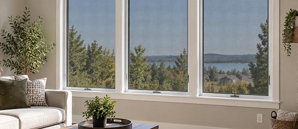
The dual-tone configuration is the most practical resolution of the black window question. The exterior delivers contrast and curb appeal, while the interior stays neutral and does not constrain paint colours, flooring or cabinetry for the life of the window. It is a particularly common configuration for homeowners who want a dark exterior without committing to a dark interior.
What Trend Window Frame Colours Are Popular in 2026?
Trend data is useful for understanding direction, not for predicting how a façade will look in fifteen years. The reliable signal in 2026 is a shift in undertone rather than a replacement of the dominant palette.
Black and Charcoal
Black remains a dominant choice for contemporary exteriors and is now established as a long-term design option rather than a short-lived trend. Charcoal alternatives such as Iron Ore and Slate are absorbing part of that demand from homeowners who want the effect with slightly less severity.
Warm Neutrals
The clearest movement in current colour direction is toward warmth. Benjamin Moore selected Silhouette AF-655, described as a blend of burnt umber with charcoal notes, as its Colour of the Year for 2026, which reflects a broader move away from cool grey toward grounded brown-based neutrals. In frame terms, that direction maps onto Cashmere, Sandalwood and Pebble.
Earthy Browns and Greens
Deep brown and dark green are recovering ground that cool greys held for most of the previous decade. Sable and Chestnut Brown deliver the depth of a dark frame with a warm base, and Forest Green continues to appeal on rural and treed properties where the exterior palette is drawn from the surrounding landscape.
Dual-Tone Frames
Dual-tone specification is now standard practice rather than an upgrade. A common configuration is a dark exterior with a white interior, allowing homeowners to create exterior contrast while keeping the interior neutral.
Which Wooden Window Frame Colours and Woodgrain Looks Suit Different Homes?
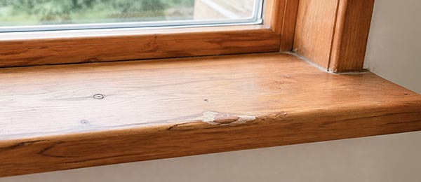
There is an important distinction between genuine wood frames and woodgrain finishes applied to vinyl profiles. The first is a structural material with an ongoing maintenance obligation, while the second is a factory-applied appearance finish on a stable, low-maintenance substrate.
Light Wood Tones
Light Walnut and Driftwood suit coastal, Scandinavian-influenced and contemporary interiors where the objective is warmth without visual weight. Driftwood, in particular, has a greyed, weathered character that bridges wood tones and cool neutral palettes, making it useful where interior finishes are grey but a natural texture is desired.
Medium Browns
Gunstock sits in the middle of the range and behaves like a traditional stained interior joinery finish. It coordinates with oak flooring and mid-tone cabinetry, and it is the most forgiving choice when interior wood elements come from several different sources and do not match each other exactly.
Dark Walnut and Chestnut
English Chestnut and Dark Walnut deliver depth and formality. They work in libraries, dining rooms and heritage interiors where dark trim is part of the original architectural language, and they are effective on the exterior of homes with substantial timber detailing.
Wood-Look Vinyl Versus Real Wood
Real wood offers depth and the ability to be refinished, at the cost of periodic sanding, sealing and repainting, plus vulnerability to moisture at the sill. Woodgrain finishes on vinyl provide visual character without a refinishing cycle, and they are factory-applied under controlled conditions rather than applied on-site.
Should the Interior and Exterior Window Frame Colours Match?
Matching is a preference, not a requirement, and the two surfaces serve different functions. The exterior contributes to curb appeal and must coordinate with a palette that rarely changes, while the interior must work with décor that may be updated several times over the service life of the window.
Full-colour frames, where the same finish runs inside and out, create a more deliberate architectural look and can work particularly well when the interior trim is already dark or when the window is intended as a strong visual feature.
Dual-tone frames make the most sense when the exterior palette demands depth, but the interior is light, when the house may be sold within the window's service life, or when different rooms have incompatible interior schemes and a single neutral interior finish keeps the specification consistent throughout the home.
Should Window Frames Match the Front Door, Trim, and Grilles?
The frame is one component in a group that also includes the entry door, soffit, fascia, exterior casing, brickmould and grille bars. These elements can be handled through exact matching, tonal coordination, or deliberate contrast, and mixing all three approaches on a single elevation produces a disjointed result.
Exact matching applies best to the components that physically touch the window. Exterior casings and brickmoulds should match the frame in almost every case, since a visible tonal break at the perimeter of the opening draws attention to the joint rather than the window. Both exterior casings and brickmoulds are produced in a range of profiles, sizes and finishes for this reason.
Tonal coordination suits the front door. A door in the same family as the frames but a step deeper or warmer registers as intentional, while an exact match across a large door slab can read as flat. Deliberate contrast is best reserved for one element only, most often the door, and it works when the surrounding palette is otherwise restrained.
Grille bars deserve separate consideration because they sit within the glazing cavity and are read against the sky rather than the wall. Decorative grille profiles are available in standard and woodgrain colour finishes, and the usual practice is to match the grille to the interior frame colour so the pattern does not visually fragment the view from inside the room.
Do Dark Window Frame Colours Fade or Heat Up More in the Sun?
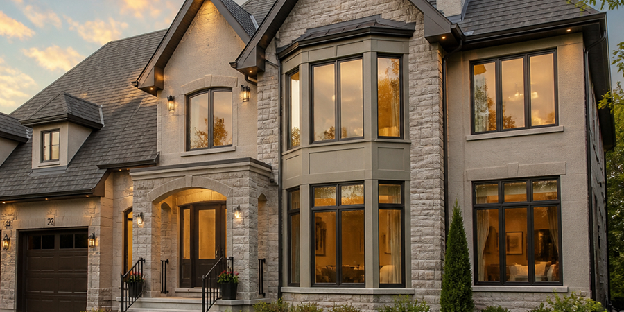
Dark finishes absorb a greater share of incident solar radiation than light ones and therefore run hotter under the same exposure. This is a physics issue rather than a product defect, and it becomes a performance question only when the profile, finish, and reinforcement have not been specified for that thermal load.
Solar Heat Absorption
Surface temperature on a dark profile in direct summer sun can substantially exceed ambient air temperature, with the effect concentrated on south and west elevations. PVC is a thermoplastic, so it expands as it heats and contracts as it cools, and dark profiles move more than white ones across the same seasonal range. Well-designed systems accommodate that movement through profile geometry, internal reinforcement, correct fastening and appropriate clearance at the perimeter.
This is a recognized engineering constraint rather than an unknown. The industry specification governing rigid PVC exterior profiles used in windows and doors sets minimum requirements for dimensional stability, weatherability, heat resistance, and heat build-up, and covers profiles with decorative finishes, including paint, laminates, and co-extruded capping compounds. The applicable AAMA specification for rigid PVC exterior profiles addresses requirements such as dimensional stability, weatherability, heat resistance, and heat buildup.
Engineer Sergey Essipov, with 20 years of experience in window manufacturing, notes: “A dark profile on a west elevation can sit well above ambient air temperature on a summer afternoon while the north side of the same house stays close to it, so one building ends up working under two thermal regimes at once. At our facility, dark units are built on multi-chamber profiles, and the reinforcement schedule is set for the most exposed elevation of the building rather than its average, because the internal chambers stiffen the section and hold the sash geometry while the outer wall of the profile expands. For the homeowner, that is what keeps a wide dark unit closing the same way in July as it does in January.”
UV Stability
Fading is a function of pigment chemistry and coating formulation, not of darkness alone. Poorly formulated finishes chalk, lose gloss and shift tone under ultraviolet exposure regardless of colour, while properly engineered coatings for PVC substrates retain tone for years. Finishes intended for exterior use should be formulated specifically to bond with PVC without cracking, peeling or delaminating, and tested for colour stability rather than simply applied.
Why Finish Quality Matters
Two black windows from different sources can perform and age very differently in service. The variables that matter are the pigment system, whether infrared-reflective pigments have been used, the application method, the quality control applied during production, and whether the profile itself was engineered for a dark finish. Ask any windows supplier how the dark finish is applied and what colour stability testing supports it, because the colour name on the sample tells you nothing about either.
The usual market approach is to treat a dark finish as a surface option applied to whatever profile is in production. Both the Ultraslim Series and the Classic Series are available across the full standard colour range. Our profiles are extruded from lead-free uPVC compounded with UV stabilizers, and the corners are fusion-welded rather than mechanically joined, which matters specifically for dark units because the corner is where repeated expansion and contraction is concentrated first. A welded corner eliminates mechanical fasteners at the joint and can provide a more continuous connection, but the finish is still exposed to the same UV and temperature effects as the rest of the profile.
Does Window Frame Colour Affect Energy Efficiency?
Frame colour has a marginal effect on the measured energy performance of a window. The variables that determine rated performance are the glazing configuration, low-emissivity coatings, gas fill, spacer design, the thermal design of the frame itself, air leakage and the quality of installation.
This is confirmed by how certification actually works in Canada. Under the ENERGY STAR programme administered by Natural Resources Canada, the Most Efficient criteria for windows and sliding glass doors are defined by a U-factor threshold of 1.05 W/m²·K or lower, or an Energy Rating of 40 or higher. Frame colour is generally a secondary factor in rated energy performance. U-factor and Energy Rating are primarily determined by glazing, low-emissivity coatings, gas fill, spacer design, frame construction, air leakage and installation. Homeowners who install units meeting the Most Efficient threshold may be eligible for federal or provincial rebates; the Canada window and door rebates guide summarizes current programs by province.
Colour Versus Actual Window Performance
The practical conclusion is that frame colour and rated energy performance should be treated as separate decisions. Choose the frame colour based on the home's architecture and exterior palette, then select the glazing and spacer configuration based on climate, orientation and performance requirements. A window supplier in Ontario and one serving the prairie provinces will often recommend different glazing packages for identical elevations, since heating degree days, solar exposure, and summer cooling load differ significantly across the country, but neither recommendation will hinge on the colour of the frame.
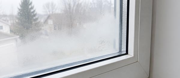
The performance that colour cannot deliver is concentrated at the edge of the glass, where a conventional aluminum spacer conducts heat straight through the assembly and creates the cold line condensation forms on. Our sealed units are built with a dual-seal, metal-free warm-edge spacer, which raises the temperature at the glass edge and shortens the conductive path that frame colour has no influence over. ENERGY STAR certification provides a consistent performance benchmark, while the most appropriate glazing configuration can vary with climate, orientation and project requirements.
Which Frame Colours Are Easiest to Maintain Over Time?
Maintenance differences between colours are real but smaller than most homeowners assume, and they concern visible soiling rather than degradation. The finish quality determines how the surface ages, while the colour determines what shows on it between cleanings.
Light finishes hide dust, pollen, and hard-water spotting well but show organic staining, algae in shaded areas, and general grime along horizontal sill surfaces. Dark finishes conceal that type of soiling but reveal dust, salt residue and water spots, particularly in bright direct light. Mid-tone browns sit in the most forgiving position, since they disguise both dust and organic staining more effectively than either extreme.
Engineer Sergey Essipov, with 20 years of experience in window manufacturing, explains:
Almost every complaint about a finish looking tired after a few seasons turns out to be a cleaning method problem rather than a coating problem. Abrasive pads and solvent cleaners remove gloss from the surface layer, and once gloss is uneven, the frame reads as faded even though the pigment has not shifted at all. Mild detergent and a soft cloth twice a year, plus a look at the perimeter seal while you are there, keeps a dark finish looking correct for the life of the unit.
Routine maintenance is the same across the palette. Wash with mild detergent and water; avoid abrasives and solvents; clear drainage weep holes; and inspect the perimeter seal annually. It is worth confirming what the finish warranty covers regarding colour retention, since coverage for the coating is a separate question from coverage for the profile or the sealed unit.
What a homeowner should end up with is a frame that still reads as the colour that was ordered, even after years of washing, sun, and freeze cycles. Coverage for that outcome falls under a 25-year transferable warranty, and transferability is directly relevant to a colour discussion because the finish is the part of the window a future buyer assesses first and fastest. Read the finish clause before committing to a dark or custom-matched colour, since that clause, rather than the sample chip, is the document that matters years later.
Conclusion: Which Window Frame Colour Is the Best Choice for Your Home?
There is no universally correct frame colour. The right choice balances architectural style, the undertone of the fixed exterior materials, interior décor flexibility, solar exposure on the most demanding elevation, and the quality of the finish itself, which has a major influence on how the frame looks over time.
The most reliable approach is to evaluate the colour systematically rather than relying on appearance alone. Order physical samples and assess them against the actual brick, siding or stucco in daylight and in shade rather than judging from a screen; coordinate the frame with the casing, brickmould, door and grilles as a single palette; treat glazing and spacer selection as separate performance decisions, and use a dual-tone configuration wherever the exterior and interior have conflicting requirements.
Before making a final decision, compare physical samples with the home's exterior materials in both direct and indirect daylight. Confirm the finish's availability for the selected profile and window type, and review the warranty terms for colour retention and finish durability.
Frequently Asked Questions
Can vinyl window frames be repainted after installation?
Repainting is generally not recommended unless the coating system has been specifically formulated and approved for the PVC substrate. Standard paint may not bond reliably to PVC, and a darker aftermarket coating can also alter the profile's thermal behaviour.
Do dark window frames cost more than white?
Dark and specialty finishes may carry a premium over standard white, particularly when they require additional finishing processes or different production controls. Custom-matched colours sit above standard finishes and typically require longer lead times.
Will a black frame make a room warmer in summer?
Usually not to a significant degree. Interior temperature is influenced much more by the glazing's solar heat gain coefficient, window size and orientation, and exterior shading than by the colour of the frame.
Should every window in the house be the same colour?
Using the same exterior frame colour throughout the house is usually the safest way to create a consistent appearance, although deliberate variation can work in some architectural designs.
How do I test a colour before committing?
Request physical samples and hold them against the brick, siding or stucco at different times of day, including overcast conditions. Colour perception shifts substantially between direct sun, shade and north-facing diffuse light, and a screen rendering is not a reliable basis for a permanent finish decision.
Are woodgrain finishes durable outdoors?
Factory-applied woodgrain finishes on vinyl are engineered for exterior exposure and do not require the sanding, sealing and repainting cycle that real wood demands. They should be cleaned with mild detergent and a soft cloth, and abrasive pads should be avoided because they damage the surface texture.
Does frame colour affect resale value?
Indirectly, through curb appeal rather than through any measurable premium attached to a specific colour. Palettes that coordinate with the house's fixed materials and avoid narrowly trend-driven choices tend to age better, which helps explain why white, black, and warm neutrals remain widely used across residential projects.
Can grille bars be a different colour from the frame?
Yes. Grilles are available in the standard colour finishes and woodgrain stains, and matching the grille to the interior frame colour is the usual approach so the pattern does not visually break up the view from inside.
People Also Ask